Revamping Black & Read:Crafting an Integrated eCommerce Experience
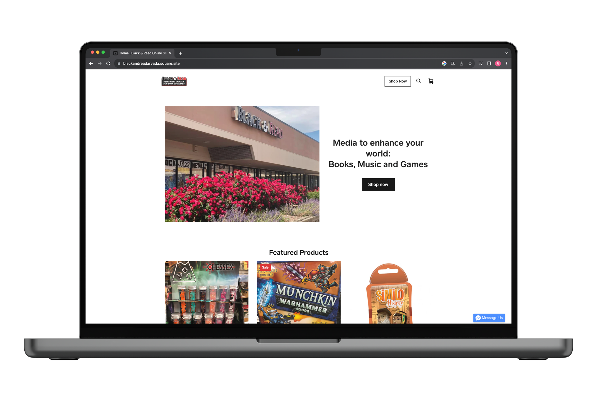
The Black & Read eCommerce experience is a simple, safe, and secure website that allows users to browse and shop for new and used books, music, and games at their favorite Arvada, Colorado based Independent bookstore, without the hassle of navigating thru traffic.
Overview
Black and Read, Independent Book, Music, and Games Store, lacked a properly maintained and updated website, with much of their online business and marketing spread across multiple sites.
This not only hindered their customers' engagement, but also diminished the shop's brand image, especially for their loyal customers, who knew of the shop's exceptional product selection, but had no choice but to drive to their physical location to shop.
Additionally, the absence of an integrated ecommerce system prevented future customers from making online purchases directly through the website, and resulted in people shopping elsewhere.
The goal was to create a website with an integrated ecommerce functionality, that was simple to use, and offered the users secure checkout.
RESULTS
With the revamping of the original website, and integrating a new ecommerce site, loyal Black & Read patrons are able purchase their extensive and unique collection of products, without needing to visit the physical location. Additionally, they will be able to do so on a site that feels as familiar and welcoming as the store itself.
Black & Read logo - designed for project following store’s style, based on Black Flag logo, vector
MY ROLE
• User Experience (UX) Designer
• User Interface (UI) Designer
TIMELINE
2 Weeks
PLATFORM
Web Based eCommerce
TEAM
Ryan Preske (Self)
METHODS
• Heuristic Evaluation
• Competitive & Comparative Analysis
• User Interviews
• Affinity Mapping
• Personas
• Usability Tests
• User Flows
• Sketches
• Low-Fidelity Wireframes
• Grayscale Prototypes
• High-Fidelity Interactive Protype
TOOLS
• Figma
• Miro
• Adobe Photoshop
• Adobe Illustrator
• Adobe Premiere Pro
• Trello
DISCOVERY & Research
Existing Website #1
Competitive and comParative analysiS
USERS WANTED:
• free shipping
• discount codes for deals
HABITS INCLUDED:
• using a desktop platform to do product research
• using loyalty programs to save, and stay informed
• liked receiving recommendations from trusted sources
Existing Website #2
KEY TAKEAWAYS INCLUDED:
• Linear layouts, with ample white space between products
• Large Hero Images on first page to show personality and the most important messages
• Clearly defined space in the header for global navigation
• Branding and Logos visible on header, with consistant branding and color throughout
USERS EXPECTED:
• encrypted checkout like Apple Pay or Paypal
• simplified website, easy navigation
Existing Website #3
Heuristic Analysis
I attempted to preform a heuristic analysis of Black & Reads website, but I discovered that they used three websites, with aspects of their information and commerce spread across these, with no way to navigate across them without a google search. This was neither convenient, nor intuitive.Though, they had three websites, much of the information was outdated by as much as a year. Additionally, the store branding was inconsistent, organization was non-existent, and though they had a robust and engaging social media presence, none of these accounts were mentioned or linked within the website. This was a problem, since much of what they mention on social media concerned products that could only be purchased by visiting their brick and mortar store.
In order to understand what a well developed eCommerce experience could look like for Black & Read, I needed to perform a C & C Analysis of other shopping sites. This would help inform potential design, as well as see the success that we could adopt, and potential failures we should avoid.
USER INTERVIEWS & PERSONA
User interviews were conducted to to help understand what was a shopper expected to see on an ecommerce website, and understand previous pain points they may have experienced when shopping. A group was selected based on common traits like, previous shopping experiences at book, music, or game retailers. Though the users had numerous suggestions on what they want from an eCommerce site, several trends arose, which will become the basis from our first sketchs, and our user personas. The personas are characters based on interview feedback trends, and are used to better understand the average user, and their habits.
SKETCHES, WIREFRAMeS, & PROTOTYPES
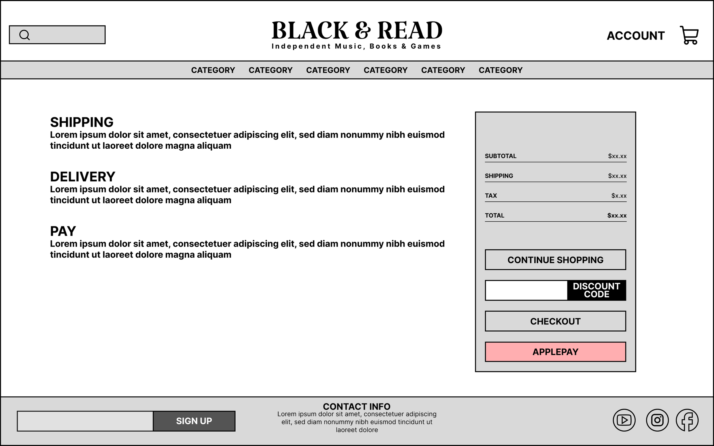
Using the suggestions from the users, the process of sketching and ideating began. The initial user flows and sketches provided the loose framework for the first prototypes. When designing the layout and features, I needed to focus on making the navigation easy, having secure checkout options, and the ability to submit user email, so they could take advantage of the stores loyalty programs.
In order to make sure these ideas and designs worked for the potential future customers of the website, usability test were conducted to determine if there were any pain points, or areas that could be improved upon like users wanting a simpler, less complicated checkout process. Additionally, personality was added to the final prototype by the addition of shop colors and a logo I created using the aesthetic and style Black & Read is known for…
Initial Sketches
Wireframes
Greyscale Prototype
High-Resolution/Final Prototype
OUTCOMES
The final product was well received, and users said that they loved the flow of the website, and it was a nice revamp. Additionally, they appreciated the attention to the brand, and thought that the design fit the store's theme, which was one of the main considerations when designing the site.
With the addition of the new ecommerce website, Black & Read will be able to tap into new audiences and shoppers, expanding their reach beyond the Denver Metro area, and allowing their users to find everything they are looking for in one simple, convenient, and secure location.
“Everything looks so great and sophisticated.”
“Great layout flow and keeping your store theme in mind when creating an official site for this company.”
“AMAAZZINNGGG redesign! Love your attention to the brand and the user’s needs!”
Feel free to reach out.
ryanjpreske@gmail.com
(812) 606-5005
Enjoying life in Broomfield, CO.


